MeisterTask Tag Alignments

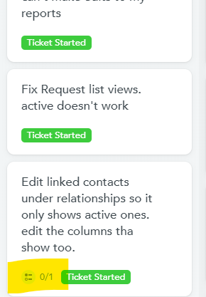
Something I'd love to see would be the alignment of tags to be on the left side. I use color coordinated tags a lot to keep track of different cards within project boards and when I add checklist items, those icons show up to the left of the tags. Would love it if they showed up after or even above the tags.
I'm hoping this is a simple change as it (hopefully) just involves moving a code around!
Comments
-
@Dessy As always, it's excellent to hear about your use cases - I totally see what you mean here. When tags are used for color coordination and getting a quick visual overview of a project board, it would be helpful to have them all in the same place on each task card. It sort of reminds me of color-coordinated tabs in a notebook.
As for whether this would be an easy fix, I 'd have to wait for input from our product team - Sometimes small front-end changes require unexpectedly large effort in the back-end!
It might not be an ideal solution, but it is possible to remove these indicators (checklists, due date, etc.) from task cards by unchecking the "indicators" box in your appearance settings:
This will indeed cause tags to be moved into the lower-left of each task card, but of course other information will be lost.
Best,
Andrew
2 -
Thanks @Andrew Lapidus! Yes, I used to have those turned off but then turned them back on because it's important for me to be able to see those icons so I don't miss it if a task has additional items within it.
0
Free Online Courses:


Categories
- All Categories
- 11 MeisterNote
- Deutsch
- English
- 126 Roadmap und Feature-Board
- Ankündigungen
- YouTube-Tutorials ansehen
- Erfolgsgeschichten lesen
- MeisterTask Academy
- Vorlagen
- Anwendungsfälle
- Help Center
- 38 Feature Roadmap
- 2 Announcements
- 2 Inspiration Hub
- 41 Ask the Community
- 60 Frag die MeisterTask-Community
- 2.1K MindMeister Community
- 1.3K MeisterTask
- Ask a Question
- Community auf Deutsch
- 577 MeisterTask - DE
- 117 Community Central


