📣 Major Update to MeisterNote (Oct. 8) 🦁

Good morning and happy Monday everyone! 👋 If you've logged in to MeisterNote today, you've probably noticed that things are looking a bit different. 😉
On Saturday, we implemented a major update to the MeisterNote interface.
With this update, our developers have taken a major steps towards improving navigation, making MeisterNote more intuitive, and laying the foundation for several important future updates.
So, what's changed?
📝 Workspaces are Now Notes
As part of this update, your team's workspaces have been converted to notes. This means that:
- All of your team's information is now organized into a simple structure of notes and sub-notes. You'll no longer need to navigate between workspaces to find notes — easily switch between all your notes (both private and shared) in the left sidebar.
- Top-level notes can now be shared with colleagues. This replaces workplace sharing. To collaborate with other team members, simply invite them to a top-level note
- All your notes and sub-notes can be accessed at any time in the left sidebar (see below)
🧭 Improved Sidebar
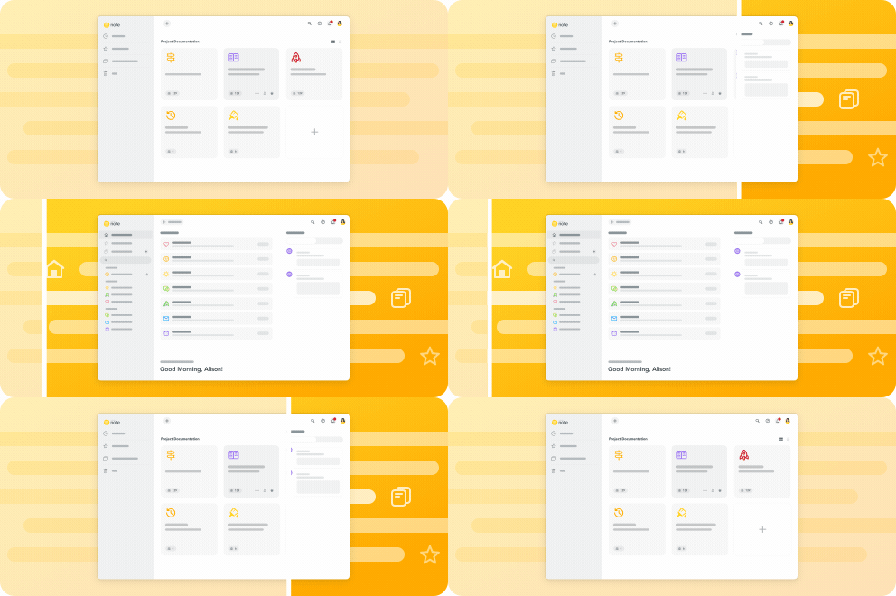
Along with its sleek new design, the new sidebar streamlines navigation between your notes and sub-notes — You can now navigate within notes or backtrack to visit other notes using a single interface:
🏠 Redesigned Dashboard
The MeisterNote dashboard has been completely redesigned to show your most recent notes and notifications:
🗺️ Breadcrumb Trails Within Notes
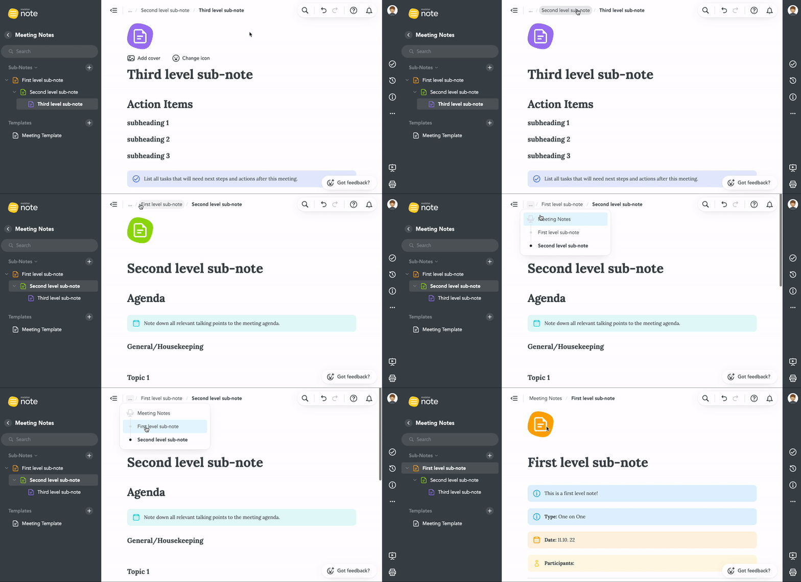
Use MeisterNote's new breadcrumb trails to easily navigate between sub-notes with multiple levels:
🤔 Why make these changes?
Improved Navigation: Most of these changes are aimed at making your content more navigable. Our goal with this update is to make your notes and sub-notes more accessible than ever before.
Laying the foundation for external sharing: Now that individual top-level notes can be shared, managing collaborators will be a much more streamlined process. You can now create and share a single note without needing to create an entirely new workspace.
Laying the foundation for Tables (of Contents): Now that workspaces have been converted into notes, the team can now focus on adding tables and other features to the note editor.
___________________________________________________________
So, what do you think? This is a major update to MeisterNote's interface, so we'd love to get your feedback. Does this update help you and your team navigate between your notes? Let us know in the comments!
Comments
-
With such a huge update, we'd love to get feedback from some of our MeisterNote power users, @Dessy , @PeterM , @Sabine Rafael , @JoiedeVivre and @Oliver Wich ! What are your thoughts?
Also, @Andres D'Andrea got a sneak peak a while back... Did the update meet your expectations?
3 -
Thanks for the tag! I really like the new update, especially the redesigned sidebar and navigation between sub-notes. Also happy to hear that this is a step on the road to external sharing!
1 -
@Andrew Lapidus Looks good! A couple of things I'd recommend:
- Moving the Good Morning to the very top
- Allowing people to collapse the left side bar
- Allowing people to collapse the notifications area. For people using this as a knowledge base, the notifications area is not applicable
Will there also be a feature where if we add a sub-note, the title of that automatically shows at the higher level note for table of contents? Would love that!
4 -
Hi @Andrew Lapidus thanks for the notice about these upgrades going live!
Yes, indeed! I find everything inside MeisterNote looking much better this morning.
I already left some comments in this post for @frank_astair that, like @Emily, expressed some concerns about the proper way of organizing notes inside "workspaces".
Likewise, I'm sure they'll find these upgrades as good news for their workflow.
Thanks to the dev team for giving us such a beautiful user interface.
Best regards.
Andrés D'Andrea
Follow me on LinkedIn and:
BSF.company - Digital Solutions For Your Business.
Technopreneuring.Com - Optimize Resources. Maximize Results.
GestionOperativa.Com - Optimiza Recursos. Maximiza Resultados.
2 -
The new update is really awesome! Thanks so much - still need to get used to the new look and feel but already love it ❤️ 🎉
2 -
Good morning guys 👋🙂
I can imagine that Meister will go in the direction of MeisterTask with the design of the UI of MeisterNote. The dashboard of MeisterTask is already very well structured and this could also bring two decisive advantages to MeisterNote:
1. the recognisable value for familiar work processes
2. already well thought-out functionalities such as the collapsible notification field.
I think this would also be in line with @Dessy's suggestions (except for the traditional arrangement of the "greeting" at the bottom on the left side 😋).
I'm sure we can expect a lot more that will be familiar to us from MeisterTask. And that will make the routine work in MeisterNote very easy.
Als Entwickler der Koper-Methodik und Experte für Prozessmanagement führe ich in meiner Agentur u. a. Retreats für Freiberufler, Solopreneure und inhabergeführte Unternehmen durch. Hier tausche ich mich gerne mit euch über die Tools MeisterTask, MeisterNote und MindMeister aus. Weitere Informationen über mich findet Ihr auf agenturkoper.de und LinkedIn.
3 -
Thanks so much to everyone for the feedback! Glad to hear that the reponse has been very positive, but a few suggestions have been very well taken: Especially the suggestion from @Dessy: We've heard from quite a few users who would appreciate a collapsible notifications bar. Our dev team agrees!
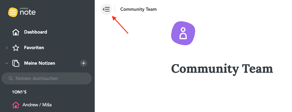
Dessy, I also wanted to ask a follow up question related to the collapsible sidebar - would you prefer a collapsible sidebar while viewing the dashboard? It is already possible to collapse the sidebar while viewing a note (see screenshot), but not while viewing the dashboard. Is this what you're referring to?
Also @Jörg Koper - Glad to hear you noticed the similarity to MeisterTask UI, and couldn't agree more with your comments! Going forward, the team will experiment with integrating our suite of products more closely with one another.
4 -
I like this new style. It´s really good organized and suits very good to my working style👍️ and don´t forget the Option to open multiple notice at once 😉
3 -
Hi all, happy Monday! 😁 I wanted to reactivate this thread and let everyone know that several of your feedback requests have been implemented with the latest update to MeisterNote! If you open MeisterNote today, you may notice that:
- Notifications now no longer appear by default on the dashboard — you can now collapse/expand the notifications widget a la MeisterTask.
- Our design team agreed with @Dessy — the "Good morning!" message is now displayed at the top of the dashboard (sorry Jörg 😀)
- Several minor changes to the UI, especially related to searching/filtering notes.
As always, thanks so much for the feedback - it's a joy for our team to develop MeisterNote with you all! Looking forward to sharing the external sharing update with you all next week!
Best,
Andrew
5 -
Our design team agreed with @Dessy — the "Good morning!" message is now displayed at the top of the dashboard (sorry Jörg 😀)
I have to admit that I like the new "Good morning" too. So I gladly forgive this step 😊
Als Entwickler der Koper-Methodik und Experte für Prozessmanagement führe ich in meiner Agentur u. a. Retreats für Freiberufler, Solopreneure und inhabergeführte Unternehmen durch. Hier tausche ich mich gerne mit euch über die Tools MeisterTask, MeisterNote und MindMeister aus. Weitere Informationen über mich findet Ihr auf agenturkoper.de und LinkedIn.
4 -
Nice to see these changes - thanks!
1 -
The updates are looking phenomenal @Andrew Lapidus!
Congrats to all the teams for this new milestone, and thanks for letting us know 🥳
Best regards.
Andrés D'Andrea
Follow me on LinkedIn and:
BSF.company - Digital Solutions For Your Business.
Technopreneuring.Com - Optimize Resources. Maximize Results.
GestionOperativa.Com - Optimiza Recursos. Maximiza Resultados.
2 -
Unfortunately, I don't like the update very much. The old concept of Workspaces containing Notes was clear. The new concept of Notes containing sub-notes is confusing. Why?
1) you can't move sub-notes between top-notes. That's just weird. In the old design it was also annoying but understandable as it could be a future feature. But now it makes zero sense. In the current hierarchy it makes no sense to treat top notes and sub notes differently, except for technical behind the scenes reasons.
2) in the old design, you had a nice central overview of all workspaces to select between. Now, everything is pushed to the sidebar where you need to switch between top-notes and also navigate sub-notes. For some reason, I (and my team) find this confusing as there's no way to use memory muscle to navigate.
3) The old central tiles representing workspaces would have been ideal to incorporate dynamic updates including the number of changes, new notes and notifications in that workspace. In our team, each workspace is a project and that would have been a great way to immediately see what's changed in each project. Now, all notifications are pushed to an endless list on the right. Maybe my suggestion might come back in some other form?
All in all, the current implementation is in my opinion more suited for semi-static wiki pages, rather than for highly dynamic project-based work.
1 -
@Andrew Lapidus Thank you so much for these updates! Apologies for the late response. I just saw all my email notifications were going to my junk but that's fixed now. I love that you guys moved the Good Morning up and have a collapsible notification bar! That makes a huge difference in the aesthetic.
Andrew, yes a collapsible dashboard bar would be nice as well. Maybe having it collapsed by default and somebody can click the icon to uncollapse it?
Aesthetics-wise, I think the tiles also looked nicer on the dashboard than the long boxes. It made it look more like Notebooks. But these are all minor things!
I really appreciate you guys making these updates and making the community heard. :)
1
Free Online Courses:


Categories
- All Categories
- 11 MeisterNote
- Deutsch
- English
- 126 Roadmap und Feature-Board
- Ankündigungen
- YouTube-Tutorials ansehen
- Erfolgsgeschichten lesen
- MeisterTask Academy
- Vorlagen
- Anwendungsfälle
- Help Center
- 38 Feature Roadmap
- 2 Announcements
- 2 Inspiration Hub
- 41 Ask the Community
- 60 Frag die MeisterTask-Community
- 2.1K MindMeister Community
- 1.3K MeisterTask
- Ask a Question
- Community auf Deutsch
- 576 MeisterTask - DE
- 117 Community Central


